Thoughtful
collaboration.
Equiv
Building a flexible brand system for a diversity hiring platform that unites four communities under one mark.
Highlights
- 200kRegistered Candidates
- 1000+Companies actively Hiring
- 70Events pan India
The
Big Idea
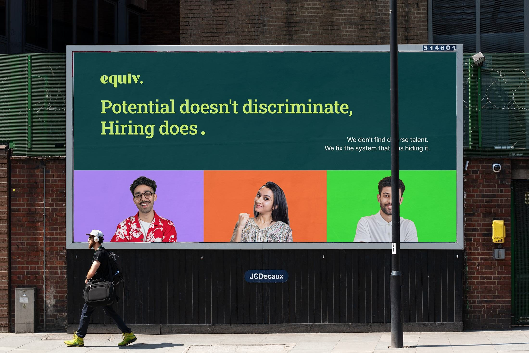
"The best hire you've never made is the one you never saw."
This was the line we kept coming back to. It challenges the corporate without preaching at them. It dignifies the candidate without rescuing them.
The
Challenge
A brand that is serious enough to sit in a boardroom and vibrant enough to fill a stadium.
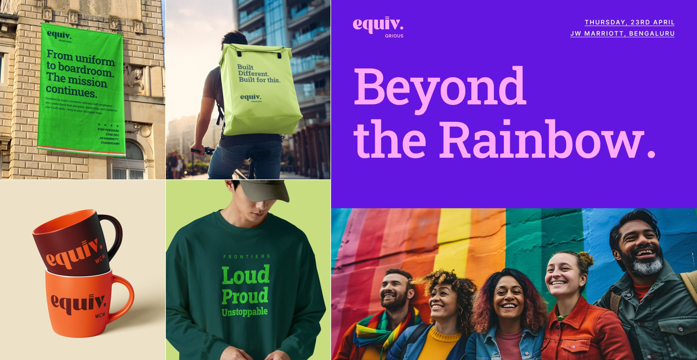
Equiv is not just a hiring platform. It runs four flagship events — each for a distinct, underrepresented community. The real question was how do we make four very different communities feel like this brand was built specifically for them — while keeping it coherent enough that a corporate sponsor sees one credible platform, not four disconnected events?
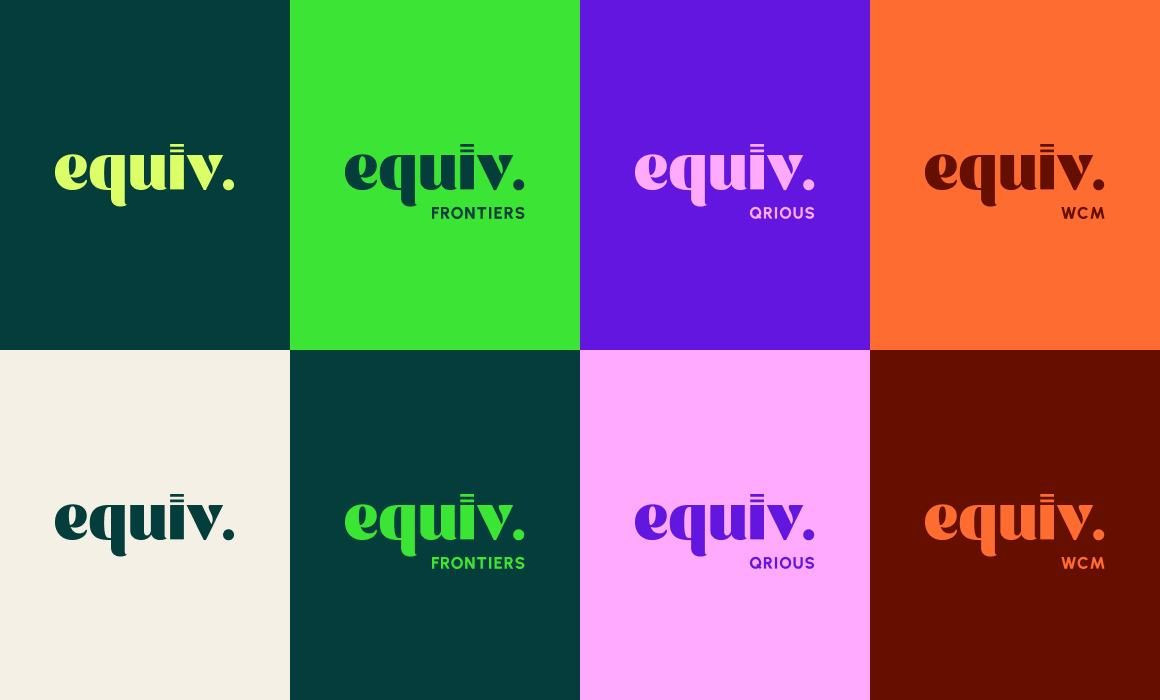
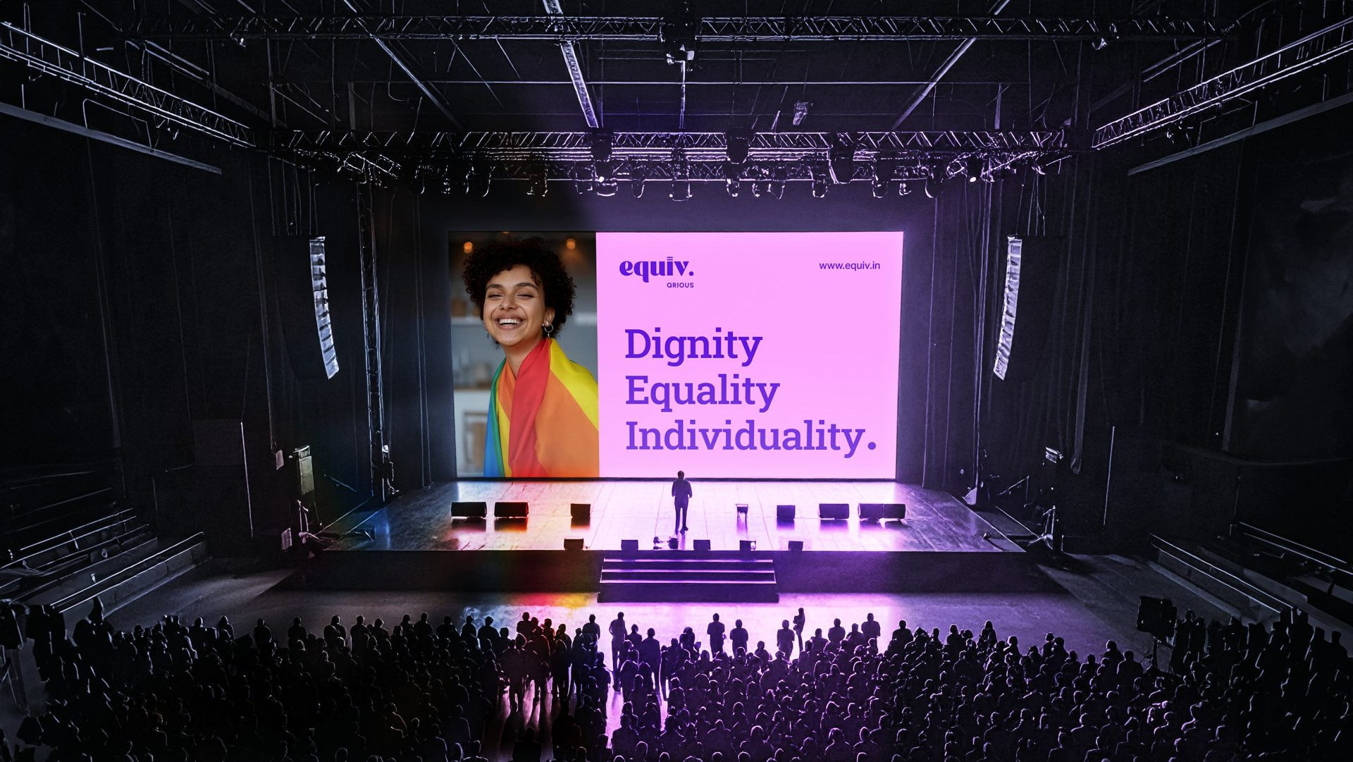
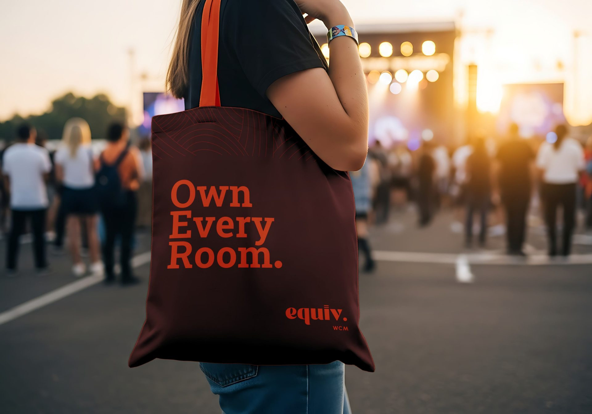
The answer was a flexible brand architecture — one mark, one type system, but a colour language that shifts per community. Consistent where it matters. Expressive where it counts.
The
Wordmark
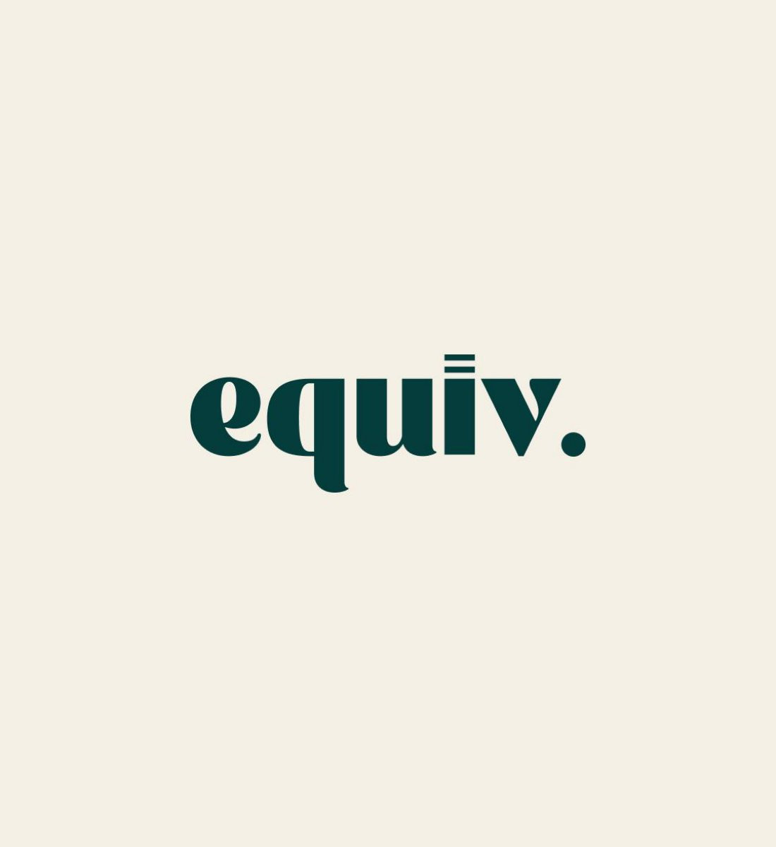
I wanted the logo to feel like a statement, not a name. So we went lowercase, and we ended it with a full stop. That wasn't a stylistic choice - it was a tonal one. It reads as complete. Confident. Done arguing about whether it belongs here.
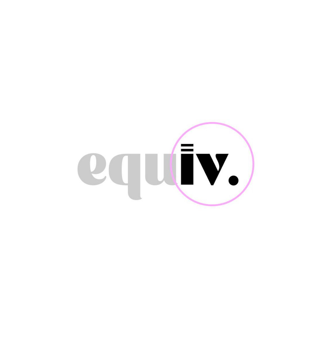
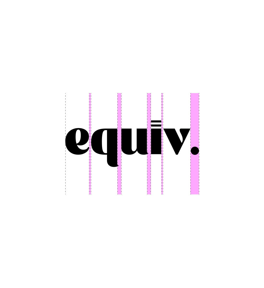
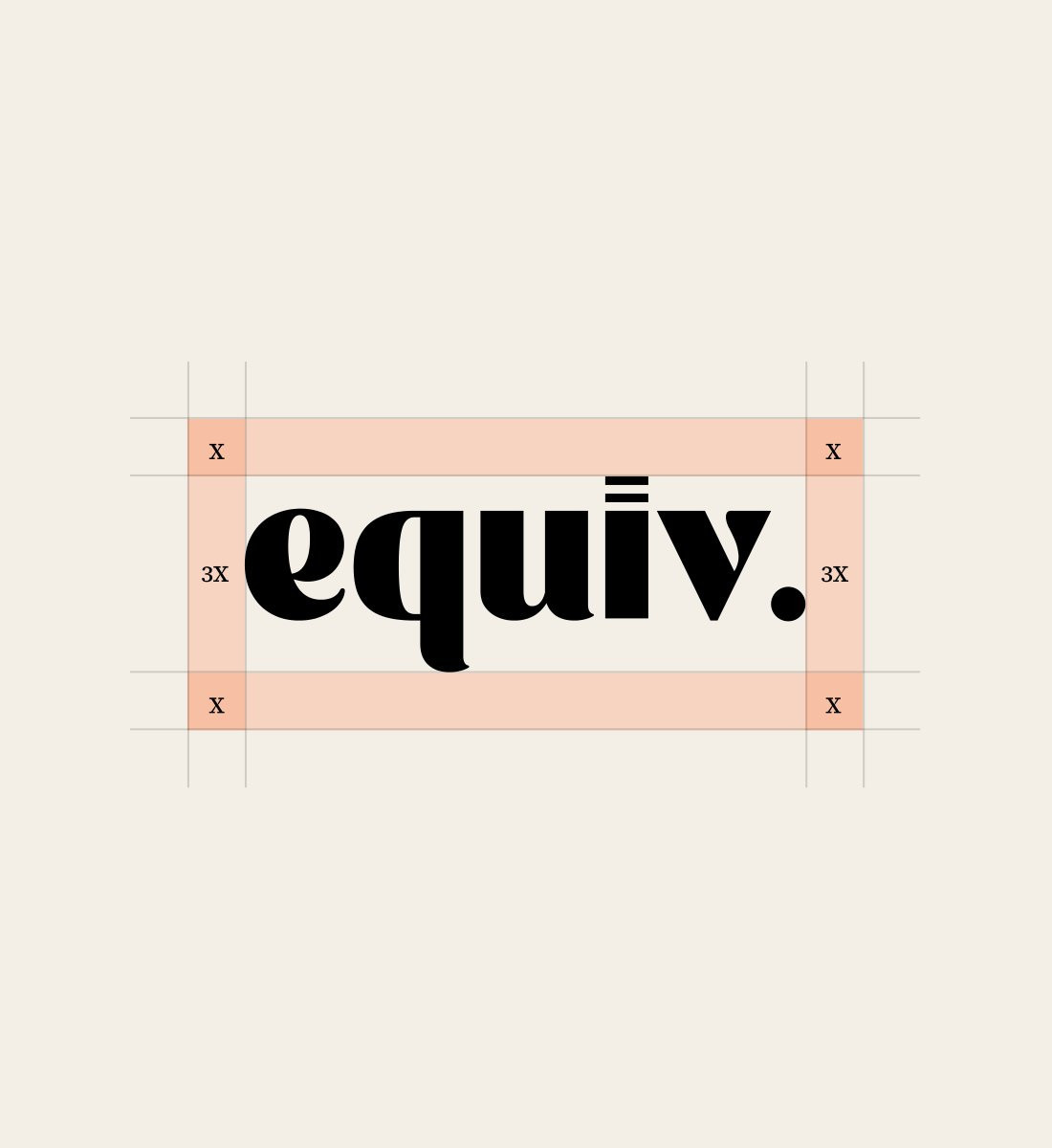
The equals sign :
The dot above the i is replaced by two horizontal bars - the equals sign. A quiet reference to equity. Most people won't notice it the first time. When they do, it stays with them forever.
3 Shapes of Diversity :
The i is a rectangle. The v is a triangle. The full stop is a circle. The three most fundamental, distinct shapes in geometry — sharing no edges, no angles, no resemblance. Together, they make something complete. That is diversity, drawn literally.
The Full Stop :
It isn't an ending. It's a declaration. We are here. We are done apologising. Period.
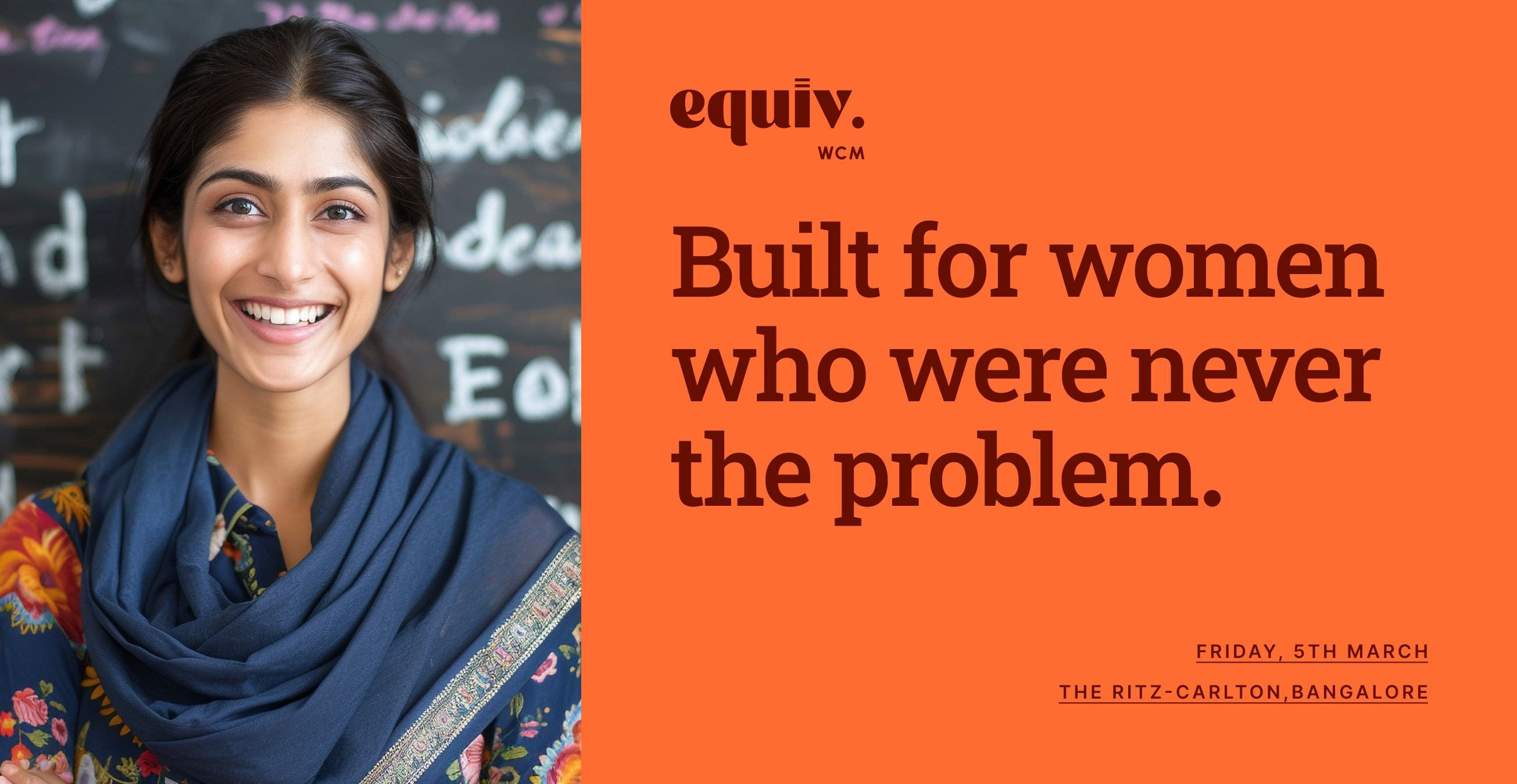
Colour
System
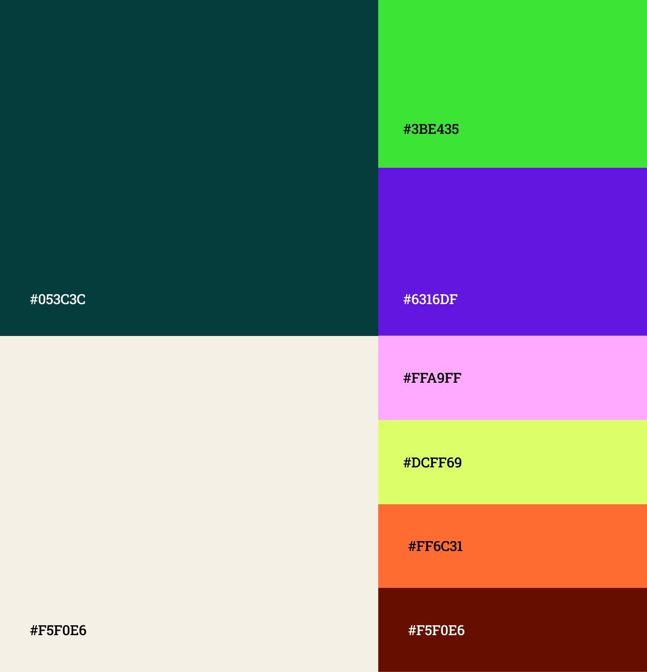
One brand shouldn't mean one colour.
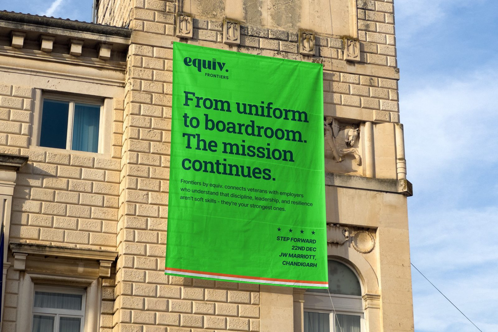
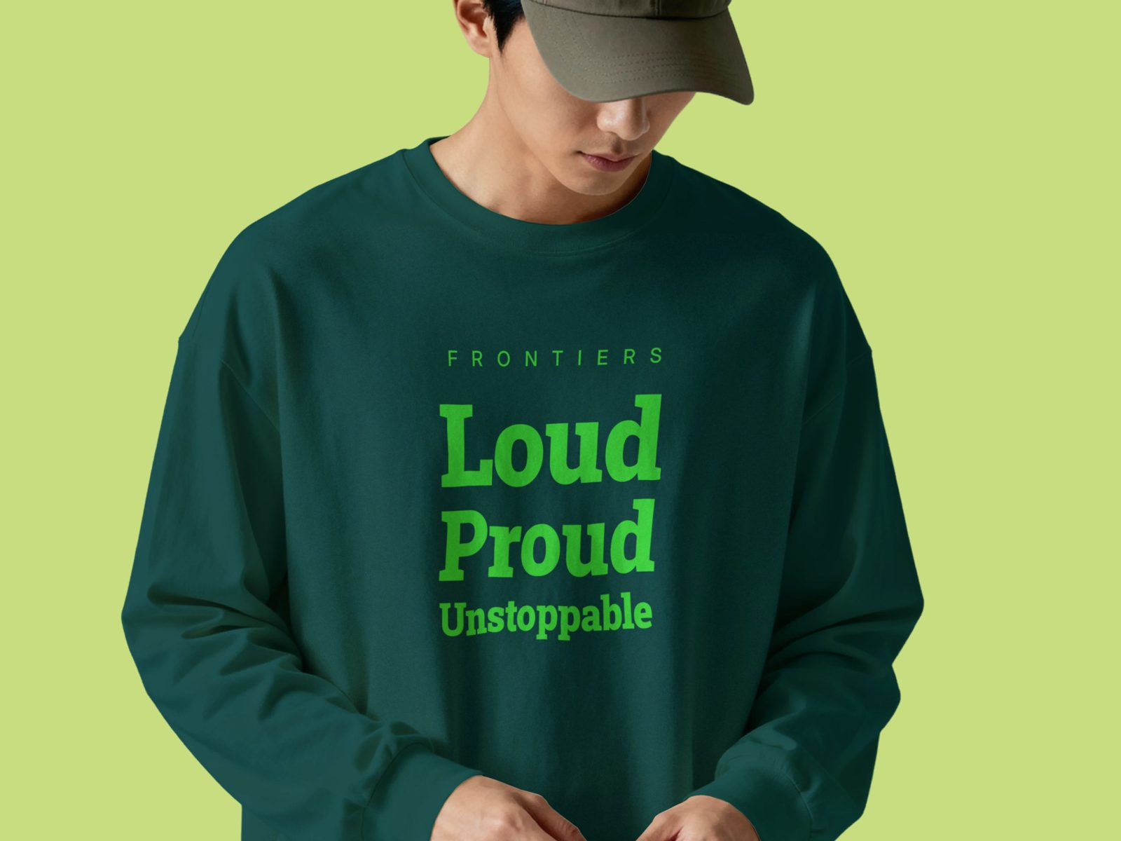
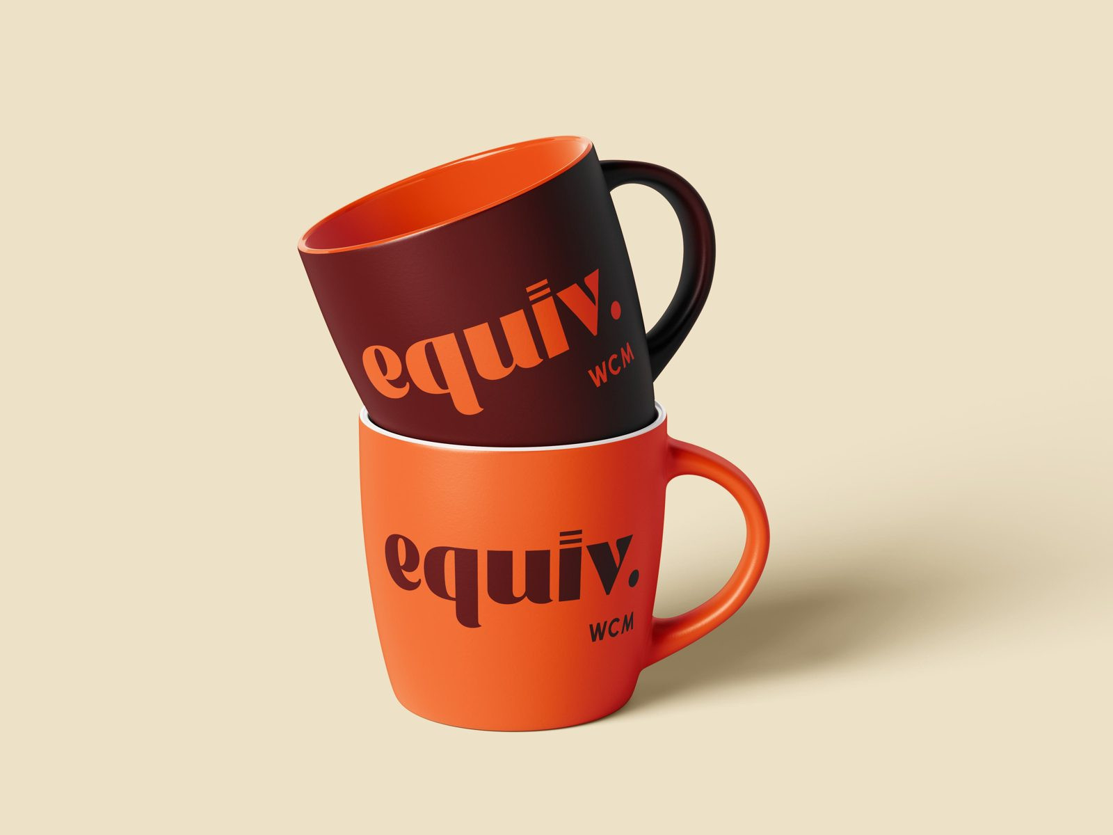
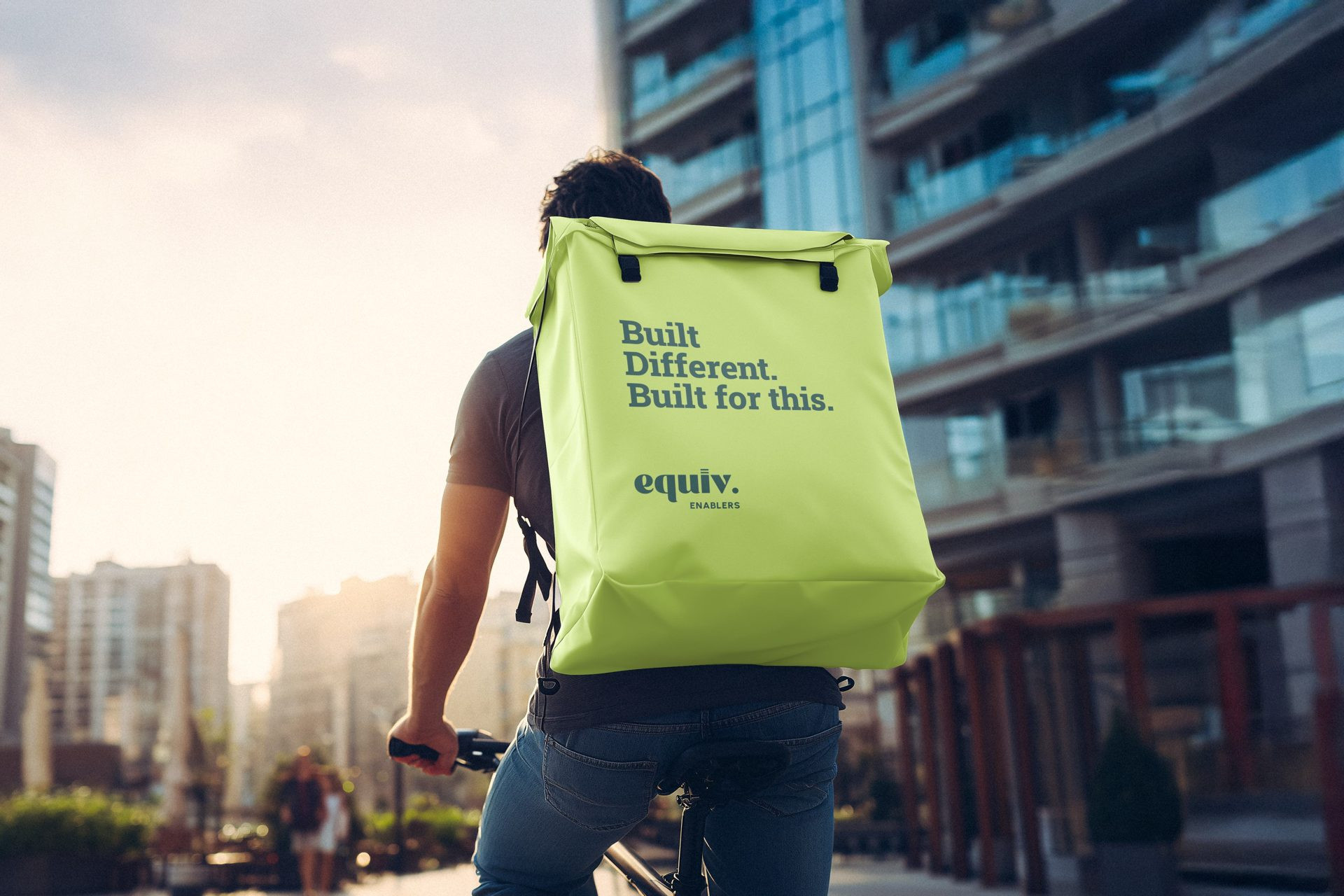
So we built a system. One anchor colour — deep forest green — that everything grows from. And four event colours that each community can genuinely call their own. The variety isn't a bug. It's the whole point.
The
Typography
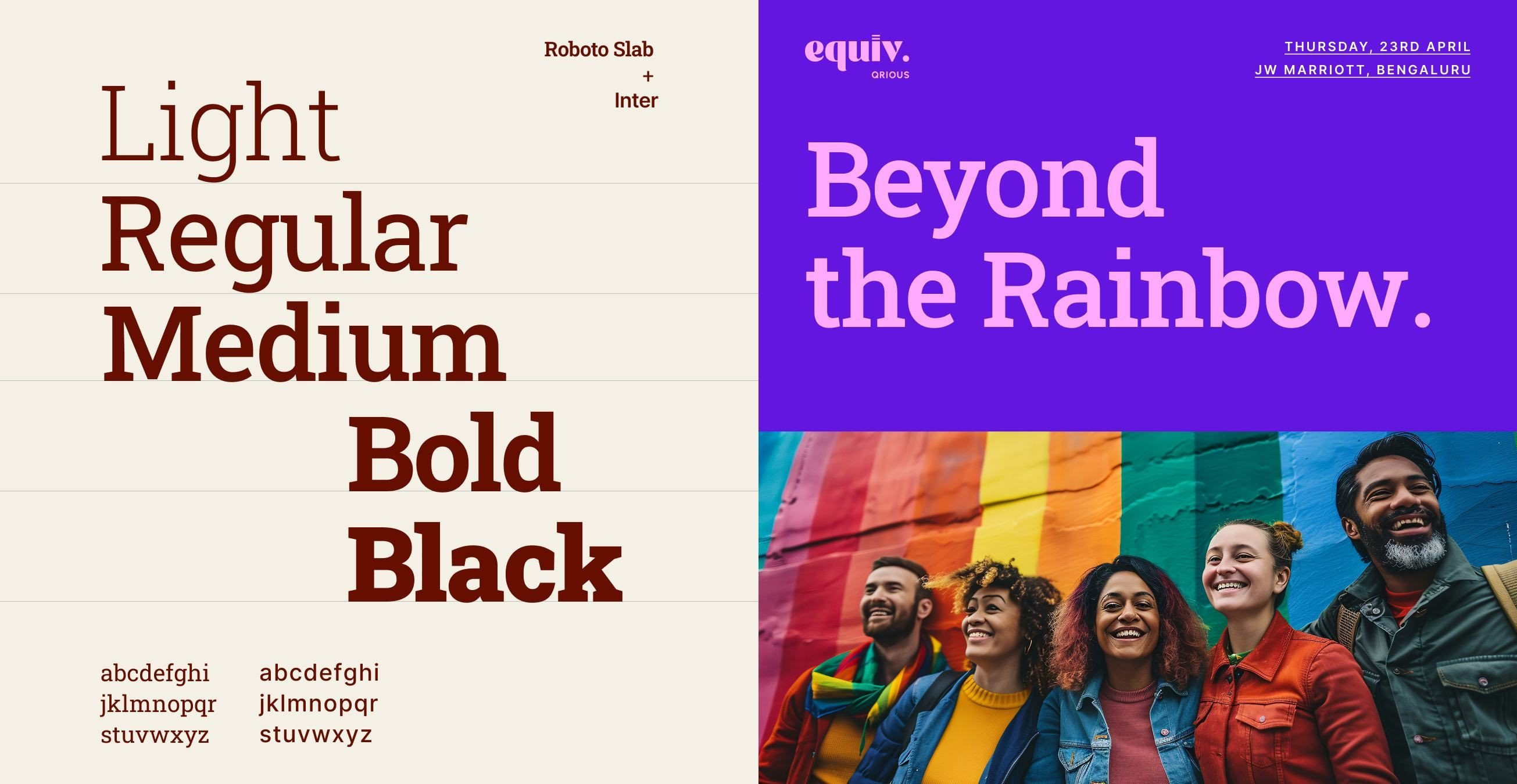
Two fonts. Two jobs. No confusion.
We chose Roboto Slab for headlines. It carries weight — the kind you associate with a newspaper front page, a court ruling, something that has been decided. When equiv makes a claim, we wanted it to feel that certain.
Inter handles everything else. Body copy, UI, labels. It's clean and invisible in the best way — it gets out of the way and lets the content do the talking.
The brand
continues.
equiv. is now part of Careernet - one of India's largest HR Tech networks.